UBIK® Client is the mobile application for viewing and modifying data, showing documents, starting navigation, visualizing POIs and much more.
Client applications are available for Android and WinX, however the features available on each of the platform dependent applications might differ. An overview of the available features can be found in the feature comparison table.
Languages
The standard UBIK® client supports multiple languages listed below (as of Version 4.3 (WinX)).
- Chinese (Simplified)
- Czech
- English
- German
- Polish
- Portuguese
- Spanish
Login
Users need to login in order to access confidential data, this can be done in the Login View.
Confirm login
Certain pages might require to confirm the login data, even if the user is already logged in. This can be done in the following way: The CheckUserOfflineCommand needs to be called with the username and password as parameter, if the login was valid, the CheckUserOfflineSuccess boolean property is set to true, which causes the text "Login confirmed" to appear in the example.
x:Name="Sign01User"
DataContext="{Binding AuthenticationViewModel, Source={StaticResource Locator}}"
PlaceholderText="User"
Text="{Binding UserName}" />
<PasswordBox
x:Name="Sign01PW"
DataContext="{Binding AuthenticationViewModel, Source={StaticResource Locator}}"
PlaceholderText="Password" />
<Button
Command="{Binding CheckUserOfflineCommand}"
Content="Confirm login"
DataContext="{Binding AuthenticationViewModel, Source={StaticResource Locator}}">
<Button.CommandParameter>
<uc:KeyValueList>
<uc:KeyValueParameter Key="UserName" Value="{Binding ElementName=Sign01User, Path=Text}" />
<uc:KeyValueParameter Key="Password" Value="{Binding ElementName=Sign01PW, Path=Password}" />
</uc:KeyValueList>
</Button.CommandParameter>
</Button>
<TextBlock Text="Login confirmed" Visibility="{Binding AuthenticationViewModel.CheckUserOfflineSuccess, Source={StaticResource Locator}, FallbackValue=false, Converter={StaticResource BoolToVisConverter}}" />
Profiles
Profiles are used to store connection information for UBIK® services. It specifies the location where to find the service along with other useful informations. Profiles are stored by UBIK whenever the user created connection information and stored it in the settings. However, profiles can also be created and edited with any text editor. Possible settings to be defined are:
- InternalConnectionSettings: Connections settings how to connect to the Content and the USAM service that has been set up.
- Application: the APPLICATION to use with the service
- AuthenticationPort: Port Number of the authentication (USAM) service (default: 777)
- AuthenticationProtocol: Protocol of the authentication service (default: https)
- AuthenticationServer: the ip address of the authentication server
- AuthenticationService: the path to the authentication service
- ContentPort: Port Number of the content service (default: 777)
- ContentProtocol: Protocol of the content service (default: https)
- ContentServer: the ip address of the content server
- ContentService: the path to the content service
- Context: the CONTEXT to use with the service
- SyncMode: the used sync mode (Online [= Auto], Manual, Offline; default:Online)
- IsDefault: true, if the profile should be the default profile
- Name: the name of the profile (will also be used to identify the database)
- If the profile name contains invalid characters like: /, ", <, >, ... they will be replaced with %_
- Project: the project name. Use this to share a single project name with more than one profile. If the project is defined, all profile with the same project will share one database.
- Customizing: the XAML subfolder to use for customized UI. This parameter can be used to share one single XAML customizing folder for multiple profiles.
- ShowHiddenSettings: show hidden settings (feault: false)
Example:
<Profile xmlns:i="http://www.w3.org/2001/XMLSchema-instance" xmlns="http://schemas.datacontract.org/2004/07/UBIK.WinX.Settings">
<Customizing>MYAPPLICATIONUI</Customizing>
<Description i:nil="true" />
<InternalConnectionSettings>
<Application>APP_DEMO</Application>
<AuthenticationPort>777</AuthenticationPort>
<AuthenticationProtocol>https</AuthenticationProtocol>
<AuthenticationServer>80.243.175.50</AuthenticationServer>
<AuthenticationService>UBIK/DBG/AUG/DEMO.250/USAM/USAM.svc</AuthenticationService>
<ContentPort>777</ContentPort>
<ContentProtocol>https</ContentProtocol>
<ContentServer>80.243.175.50</ContentServer>
<ContentService>UBIK/DBG/AUG/DEMO.250/CONTENT/UBIKContent.svc</ContentService>
<Context>CXT_DEMO</Context>
<SyncMode>Online</SyncMode>
</InternalConnectionSettings>
<IsDefault>true</IsDefault>
<Name>DEMO.250.AT</Name>
<Project>DEMO.250</Project>
<ShowHiddenSettings>false</ShowHiddenSettings>
</Profile>
Content Browser
Allows to navigate through the entire data model in a hierarchical manner, as it is published by the server.
Initially, a list of objects ("root objects") is shown. Upon selecting an object, a new browser is opened for that object, showing details about it. When an object is selected in the content browser, it is called the browser's context. For such a contextual object, child objects and selected properties are shown. Also, there is a context menu providing actions related to the currently selected object.
Status Bar
Whenever content is being saved into the local database (for example, after a branch is downloaded from the server), there will be a blinking symbol indicating the saving activity is happening in the background. During that time, the user is advised to not logout or close the app because the content might be lost otherwise. However, it is okay to undertake other tasks such as browsing, editing or downloading branches.
Child Page
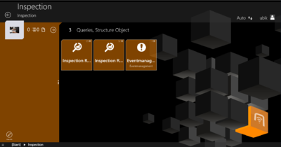
The child page shows the context of a selected object.
The global status bar shows the icon, the name and the description of the selected object. An arrow on the left side allows the user to navigate back to the parent object. On the right side the currently logged-in user is indicated. By clicking on the username one is able to navigate back to the home screen or log off.
The right side of the child page shows child objects of the current object. Each child object is represented by an icon, a name and a description.
On the left side of the child page the current object´s high priority properties are shown. By clicking on a live value property, the live value details dialog opens. By clicking on an editable high priority property, an editor opens . If a property was edited a save button is shown in the lower left corner, allowing the user to commit the changes. If a property of a query object was edited an evaluate button is shown in the lower left corner, allowing the user to run the query with the changed propery.
Details Page
Context Menu
Objects
Root objects vs child objects
The first entry point in the Content Browser is the list of root objects.
Task objects
Query objects
Safety relevant objects
Commissioning objects
Locked objects
Properties
Authentication Properties
Authentication Properties are properties which need a user authentication (through a password field) to be edited.
Live value properties
High priority properties
High priority properties are properties having a priority higher than the priority threshold.
Selective List Properties
Properties with value records
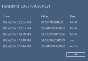
In addition to its value, a property might also bring along a series of value records showing "who changed the value at what time".
When such records exist, the property row shows a special symbol on the right side. After a right click (with mouse) or a long tap (with touch) on the property row, a dialog will be shown to present these records (sorted by their time, recent ones on top).
String properties with length restrictions
A string property can be configured with a length restriction. The client property editing UI doesn't allow users to confirm values exceeding the limit.
Editors
Geo Editor & Teach In
Editing expected location use GEO coordinate and position it with map (by using UBIK WinX).
Geo Editor
- Create a new GEO property, navigate to the property by click on the property name
- Switch to "Property" tag, there are 6 attributes
- Description: the property's name, will be fill out automatically by system with gave name
- Barcode:
- Coordinates: giving corresponding value by click on test area
- Marker ID:
- QR Code:
- Poi Group ID: property's name with group ID in brackets
WinX
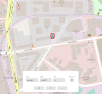
- Click on "Coordinates" icon, a full screen map will show up with highlighted GEO icon in the middle of the map
- Text box shows GEO information in "LAT." (latitude) "LON." (longitude) "ALT." (altitude)
- Click anywhere on the map, the GEO icon will show on the position, text box will show corresponding coordinate
- "Teach-in" button will lead the icon to the current coordinate in real
Xamarin
Guid editor
To edit Guid properties (that do not have a selective list available), we have implemented a special system. Since a Guid property always just contains the Guid as a reference to another object, we can use a query to find the object we want to assign to this property.
When the Guid property has a FilterQuery datamember (which should contain the guid of a query), it will become editable through this query. Note that this FilterQuery guid will not actually be visible in the client. All this should be setup in the backend, the client has no control over this.
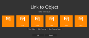
When clicking an editable Guid property, you will see a dialog with up to 3 extra buttons added (see image):
- View Object
- This button will be enabled when there is a valid guid assigned to the property. Clicking this button will immediately navigate to the referenced object.
- Edit Property
- If the property has a valid FilterQuery assigned to it, clicking this button will launch that query. If no FilterQuery is assigned, this button will be invisible. Although the button is clickable in Multi Select mode, it is currently inoperable.
- Clear Property Value
- If the property has a guid assigned, the user can press this button to reset the value back to empty.
Additionally, if a valid FilterQuery is assigned, the user will see the results of that query inline, if the query delivers 200 results or fewer. The user can select an item from this horizontally scrollable list, and press "OK" to assign the UID of the selected object to the Guid property. This is useful for cases where the user does not want to jump into the full query to be able to select an object.
If the user does choose to launch the full query page (or if the query returns over 200 objects), they can click any of the displayed items in the query's child list. When clicking one of them, it will immediately be set as the reference in the original Guid property. To cancel selecting an item (and stop editing the property), simply navigate to any other page (by pressing back, using navigation bar, etc).
Documents
UBIK supports and displays document objects and a bunch of actions related to them (editing, redlining, creation, thumbnails, ...).
Fit Mode
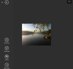
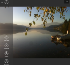
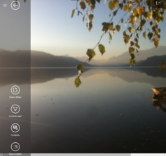
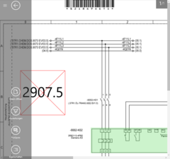
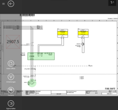
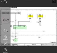
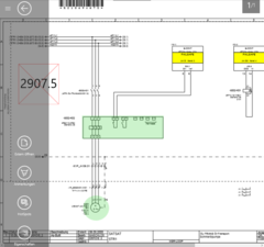
By default, documents are displayed in their original dimensions. But administrators can also configure different fit modes for each document. The following demonstrates how documents can look under different fit modes.
| Unspecified / Unscaled / Default | Fit to container | Fit to width | Fit to height |
|---|---|---|---|
 |
 |
 |
|
 |
 |
 |
|
| When using a FlipView for documents in your customized XAMLs, you need to additionally apply the fit mode by yourself. |
| Double tapping on a document toggles the display between "Fit to width" and the fit mode that document is configured with. |
Customizing Possibilities
Editing
For editable documents, there is an edit button in the bottom app bar. It allows the user to edit a document file using the default app of the OS. If a file is changed during the edit, the same save button appears just like it does for content with changed properties.
An alternative way to start editing is to right click on a document's thumbnail, which brings up an overlay of buttons, and then select the edit button. The difference here is that there is no save button and any changes are automatically saved (and committed if in online mode).
Offline availability
When a user selects a branch to bring offline, files of all document objects underneath are downloaded in principle. However, they can also be selectively configured to be ignored with a classification on the server-side. Once a document is classified as offline available, the document file will not be removed when the storage for already synchronized document files is cleared.
| This is not to be confused with the accessibility related to user rights. The logic here is "some documents do not have to be downloaded", not "some documents can not be downloaded/accessed". In other words, a user can browse to and open the document regardless of this configuration. |
Clear Online Documents
By clearing the online documents, it is possible to free up system memory if needed. It can be triggered by pressing the button "Clear online documents" in the general settings tab. Online documents are documents already uploaded to the server. They can be downloaded anytime agian when the client is connected to the server. However, documents classified as offline available will not be affected and will always stay on the device.
AR Features
POI View
Brings up the POI View|Augmented Reality view and displays Points of Interest (POI's) related to the current location of the mobile device.
Markerless
Map View
Opens the Map View and displays Points of Interest (POI's) related to the current location of the mobile device.
Positioning
UBIK® clients use a Location Manager in order to gain knowledge about their position, so it can help the user navigate to his/her target.
The user can choose one of different positioning modes optimized for different environments. Most of them incorporate multiple technologies for calculating positions or checking their reliability.
Positioning modes
- Use all - uses all available position sources
- LLA only mode - used for positioning using markers only
- Beacon Proximity mode - uses iBeacon proximity and LLA only
Technologies
GPS
GPS is used as a primary positioning input source for outdoor areas. Its precision depends on the environment and satellite availability. With good circumstances, the accuracy varies between 1 and 10 meters.
LLA markers
LLA markers basically are QR codes with location data encoded into them - which can be used for positioning when they are scanned.
Object Proximity Positioning
The location of nearby Geo-Objects can be used for positioning.
The position of a Geo-Object can be used manually by pushing the button Use Location in the Context Menu.
The geo information of an object gets used automatically if exactly one single object is found through scanning. If more objects are found, their geo information doesn´t get used. Scanning includes Bar Code, QR Code, OCR and RFID. The automatic use of Geo-Object´s location can be turned off by disabling the "EnableObjectProximityPositioning" setting.
Beacon-Proximity Positioning
The Beacon Proximity Mode detects if the user is in the proximity of a beacon. The proximity region is defined by a proximity distance which creates a sphere around the beacon. Whenever the calculated distance to a beacon is smaller than the proximity distance, the user is supposed to be at the position of the beacon. If multiple regions intersect the user is supposed to be at the position of the nearest beacon. In order to use Beacon Proximity as a Positioning System, Bluetooth Low Energy has to be available and enabled on the mobile device. If a new environment should be equipped with iBeacon-Positioning, an expert has to mount iBeacons on known positions and calibrate the propagation factor of these beacons. Proximity beacons can be configured using SYSCLS PROXIMITY BEACON.
Finding Objects
Free Text Search
ID Marker
QR Code
Bar Code
RFID Code
Provides a fast and convenient way for users to find objects that are identifiable through RFID tags.
OCR
Linked objects
It is possible to display values of linked objects by using the "LinkedLevel" property. An example can be seen here, where Items[0] is a Guid property linking to another object. The ItemsControl then binds to the Properties of the linked object.
<ItemsControl ItemsSource="{Binding Properties.AllItems}" />
</Grid>
