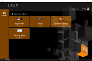
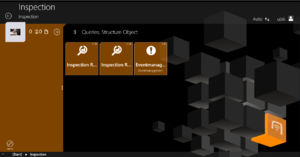
The WinX User Interface can be vastly customized using XAML. Starting with Version 3.2, this customizing experience can be largely controlled with the new Developer Mode.
Templates
The UI is controlled by several predefined XAML templates which are loaded into the App at startup. There is a set of default template deployed with the App at installation, however, each of them can be overridden by placing the respective file in the folder [AppInstallPath]\LocalState\XAML For further information see UBIK Templates.
General
Controls the overall styling and behavior of the App, like standard Brushes (Colors) and Fonts.
AuthenticationPage
- UBIKSplashArea.xaml
- UBIKPageNavigation.xaml -> Deprecated and changed to UBIKHomePageButtons.xaml
- UBIKProfileItem.xaml
Content Pages
- UBIKObjectIcon.xaml
- UBIKObjectIconSmall.xaml
RootPage
- UBIKMainLeftArea.xaml
- UBIKMainItem.xaml
- UBIKMainItemSmall.xaml
ChildPage
- UBIKChildItem.xaml
- UBIKChildItemSmall.xaml
- UBIKChildArea.xaml
- UBIKChildAreaSmall.xaml
- UBIKChildAction.xaml
- UBIKPriorityPropertyItem.xaml
DetailsPage
- UBIKDocumentItem.xaml
- UBIKDocumentItemSmall.xaml
Specific UBIK® Controls
Basic
CoolGridSplitter (UBIK.WinX.Controls)
Allows to make rows or columns of a grid user-resizable
Example:
x:Name="ChildAreaGridSplitter"
Height="10"
HorizontalAlignment="Center" VerticalAlignment="Bottom"
Background="Transparent"
Foreground="White"
ResizeBehavior="CurrentAndNext" ResizeDirection2="Rows"/>
UBIKImageEditor
It's essentially the SfImageEditor from Syncfusion. Theoretically, customizability mentioned in their official documentations should be supported in UBIK® out of the box. One example is to customize the visibility of the toolbar of such an image editor. The following example hides the toolbar.
xmlns:sfImageEditor="using:Syncfusion.UI.Xaml.ImageEditor">
<sfImageEditor:SfImageEditor.ToolbarSettings>
<sfImageEditor:ToolbarSettings IsToolbarVisiblity="False"/>
</sfImageEditor:SfImageEditor.ToolbarSettings>
</ctrls:UBIKImageEditor>
Advanced
EvalExpression
Allows to evaluate a C# expression in XAML, using any amount of EvalExpressionParameters
Converters
These are classes in our code used to convert one form of data into another (For example: string to color, bool to string, color to string…). We are using it often on Data Bindings, so we can simply ‘change’ the data that got provided by the model. Mostly, in our environment, we use the Converters for the Visibility Property, Background Property or the Source Property (converting Byte to an Image).
Initialization of a converter in a XAML file:
x:Key="ItemCountLesserThanToColConverter"
EqualOrBiggerThan="Visible"
LesserThan="Collapsed" />
<!-- This Converter example specifically counts the items that will go into a container (ListView etc..) and gets a parameter passed when it should be a certain visibility. Next example shows you how to configure your converter.-->
Using the ItemCountLesserThanToVisiblity in a visibility attribute:
<!--In this case is the parameter 13, so when it gets passed the Count gets checked e.g. how many items there are and when it’s under 13 it will collapse. -->
Example of an EqualToVisConverter being used in order to set the visibility of a grid:
</Grid>
<!--The grid will be ONLY visible if the value of this MetaProperty equals the value of the converter parameter. -->
Example of a StringFormatConverter, which converts a value into a string and also accepts a parameter, in this case the GlobalDateTimeFormat, which ‘tells’ the converter how to format the string:
List of all converters
For a complete and up-to-date list of all converters, please refer to the developer mode.
Advanced
Returns a formatted string where placeholders will be filled with values supplied to its parameter properties (Param0, Param1, Param2).
Example:
<StackPanel.Resources>
<!-- Instantiate the converter and bind the the Param0 to a SearchBox on this page -->
<converters:StringFormatConverter x:Key="URIConverter" Param0="{Binding ElementName=SkypeQuery, Path=QueryText}" />
</StackPanel.Resources>
<!-- Create a SearchBox that calls the typed Name via Skype on enter -->
<SearchBox
x:Name="SkypeQuery"
Width="240" Height="40"
FontSize="18"
PlaceholderText="Call Skype">
<Interactivity:Interaction.Behaviors>
<Core:EventTriggerBehavior EventName="QuerySubmitted">
<Core:InvokeCommandAction
Command="{Binding NavigateToURICommand}"
CommandParameter="{Binding ElementName=SkypeQuery, Path=QueryText, Converter={StaticResource URIConverter},
ConverterParameter=skype\:\{0\}\?call }" />
</Core:EventTriggerBehavior>
</Interactivity:Interaction.Behaviors>
</SearchBox>
</StackPanel>
Evaluates a C# expression with 3 optional variables (Param0, Param1, Param2) and returns the result. The object fed into the converter can be referenced in the expression as Context.
Example:
<Grid.Resources>
<!-- Instantiate the converter and bind the Context to the current DataContext, the Param0 to a UI element of this page -->
<converters:EvalExpressionConverter x:Key="CodeConverter" Context="{Binding}" Param0="{Binding ElementName=ChildListView, Path=Name}" />
</Grid.Resources>
<StackPanel Orientation="Horizontal">
<!-- Create a TextBox where we can enter a C# expression -->
<TextBox
x:Name="CodeQuery"
MinWidth="240" Height="40"
FontSize="18"
PlaceholderText="Expression">
</TextBox>
<!-- Create a TextBlock where we display the result of the compiled expression -->
<TextBlock Text="{Binding ElementName=CodeQuery, Path=Text, Converter={StaticResource CodeConverter}}" />
</StackPanel>
</Grid>
Converts a collection into a view that can be filtered using C# expressions and returns the (filtered) result. The object fed into the converter can be referenced in the expression as Item.
Example:
<Grid.Resources>
<!-- Instantiate the converter and bind the Source to the collection we want to use on a UI element of this page -->
<converters:CollectionToViewConverter x:Key="ColConv" Source="{Binding Children.Items}" />
</Grid.Resources>
<StackPanel Orientation="Horizontal">
<!-- Create a TextBox where we can enter a C# expression -->
<TextBox
x:Name="FilterQuery"
Height="40" MinWidth="240"
Margin="0,10,10,0" HorizontalAlignment="Right"
VerticalAlignment="Top"
FontSize="18"
PlaceholderText="Filter" />
<!-- Create a ListView and bind its ItemsSource to the expression pulled through the converter -->
<ListView
x:Name="ChildListView"
HorizontalContentAlignment="Stretch"
ItemsSource="{Binding ElementName=FilterQuery, Path=Text, Converter={StaticResource ColConv}}">
</ListView>
</StackPanel>
</Grid>
Converts a template selector to use templates with a certain suffix (e.g. "_Grid" to use "UBIKChildItem_Grid.xaml" instead of "UBIKChildItem.xaml"). The small template file name will be combined as <TemplateName><Suffix>Small.xaml (e.g. "UBIKChildItem_GridSmall.xaml").
Example:
<Grid.Resources>
<!-- Instantiate the template selectors and bind them to the instance of the coverter -->
<tpl:ChildItemTemplateSelector x:Key="ChildItemTemplateSelector" />
<tpl:ChildItemTemplateSmallSelector x:Key="ChildItemTemplateSmallSelector" />
<converters:ChildItemTemplateSelectorSuffixConverter x:Key="ChildItemTemplateSelectorSuffixConv" TemplateSelector="{Binding Source={StaticResource ChildItemTemplateSelector}}" TemplateSmallSelector="{Binding Source={StaticResource ChildItemTemplateSmallSelector}}"/>
</Grid.Resources>
<!-- The itemselector template binds to the suffix that should be used (in this case a binding to a stored profile parameter is used to switch the item template suffix between "_Grid" and "_List" -->
<StackPanel>
<CheckBox Grid.Column="0">
<Interactivity:Interaction.Behaviors>
<Core:EventTriggerBehavior EventName="Checked">
<!-- Store the Profile Variable "ChildItemsViewMode" to Grid or List - depending on the check state of the check box -->
<Core:InvokeCommandAction Command="{Binding StoreProfileParameterCommand}" CommandParameter="ChildItemsViewMode=_Grid"/>
</Core:EventTriggerBehavior>
<Core:EventTriggerBehavior EventName="Unchecked">
<Core:InvokeCommandAction Command="{Binding StoreProfileParameterCommand}" CommandParameter="ChildItemsViewMode=_List"/>
</Core:EventTriggerBehavior>
</Interactivity:Interaction.Behaviors>
</CheckBox>
<ListView
x:Name="ChildListView"
HorizontalContentAlignment="Stretch"
ItemTemplateSelector="{Binding Path=StoredProfileParameters[ChildItemsViewMode], Converter={StaticResource ChildItemTemplateSelectorSuffixConv}, ConverterParameter=Normal, FallbackValue=List}"
ItemsPanel="{StaticResource ChildPageItemsPanelTemplate}"
ItemsSource="{Binding Children.Items}"
ScrollViewer.VerticalScrollBarVisibility="Auto" SelectionMode="None">
<ListView.ItemContainerStyle>
<Style TargetType="ListViewItem">
<Setter Property="HorizontalContentAlignment" Value="Stretch" />
<Setter Property="Padding" Value="0" />
<Setter Property="Margin" Value="0,0,16,0" />
</Style>
</ListView.ItemContainerStyle>
<ListView.ItemContainerTransitions>
<TransitionCollection>
<EntranceThemeTransition FromHorizontalOffset="400" />
</TransitionCollection>
</ListView.ItemContainerTransitions>
</ListView>
</StackPanel>
</Grid>
Properties
| The previously listed available properties for binding is removed from here. Since it's more accurate and up-to-date to use the Developer Mode to inspect them in your version of the clients. |
Commands
| The previously listed available commands for binding is removed from here. Since it's more accurate and up-to-date to use the Developer Mode to inspect them in your version of the clients. |
Examples for commands with complex parameters
CaptureMediaCommand
UWP
...
xmlns:controls="using:UBIK.WinX.Controls"
Command="{Binding CaptureMediaCommand}">
<Button.CommandParameter>
<controls:KeyValueList>
<controls:KeyValueParameter Key="MediaCaptureMode" Value="Video" />
<controls:KeyValueParameter Key="ChildMetaDefUid" Value="6170a068-2314-4444-ad62-0da99769a048" />
</controls:KeyValueList>
</Button.CommandParameter>
</Button>
Xamarin
...
xmlns:classes="clr-namespace:UBIK.CPL.Classes;assembly=UBIK.CPL"
Command="{Binding CaptureMediaCommand}">
<Button.CommandParameter>
<classes:KeyValueList>
<classes:KeyValueParameter Key="MediaCaptureMode" Value="Video" />
<classes:KeyValueParameter Key="ChildMetaDefUid" Value="6170a068-2314-4444-ad62-0da99769a048" />
</classes:KeyValueList>
</Button.CommandParameter>
</Button>
| The KeyValueList parameter is supported only . In previous versions, simple string parameters were supported. |
| Whether the creation succeeds also depends on the server configuration. For example, if "*.mp4" is not included as a selective list item in the file type meta property, video document creation will not be possible. |
- MediaCaptureMode: Photo, Video, Audio. Defaults to Photo if unspecified;
- ChildMetaDefUid: The Guid of the child meta definition to be used for creating the captured media document. If unspecified, the client will simply pick the first child meta definition that is of media type and is allowed under the current context/parent object.
Differences between Xamarin and UWP
As you maybe already noticed we have two different clients, one is WinX UWP and the other one Xamarin, which is used to develop clients for three different platforms namely iOS, Android and new UWP (-> it doesn’t really differentiate from the previously mentioned UWP except it’s developed in a different framework which is Xamarin in this case). The customizing stays the same in case of the syntax, but there are some differences in the naming of controls and attributes. Unfortunately, there is no decent documentation of these differences, but the Microsoft documentation and in general the internet can support you when searching e.g. for a control in Xamarin that you used in UWP. More specific documentations about Xamarin Customizing can be found under Xamarin XAML.
Namespace changes
Starting from the UBIK UWP client, we have restructured & renamed some of our outdated or inaccurate namespaces. This means modifications are necessary for any previous XAML customizing code that refers to these changed namespaces. The complete list of such changes is documented below.
| V.2.6 | V.3.0 | |
|---|---|---|
| Name- space prefix |
UBIK.Win8 | UBIK.WinX |
| UBIK.WinX.UI | UBIK.UI | |
| UBIK.WinX.Utility | UBIK.Utility | |
| UBIK.WinX.Library | UBIK.Library | |
| UBIK.WinX.DataProvider | UBIK.DataProvider | |
| UBIK.WinX.SyncHandler | UBIK.SyncHandler | |
| UBIK.WinX.DatabaseConnector | UBIK.DatabaseConnector | |
| UBIK.WinX.ContentDatabase | UBIK.ContentDatabase | |
| UBIK.WinX.MRO | UBIK.MRO | |
| UBIK.WinX.Coding | UBIK.Coding | |
| UBIK.WinX.DataService | UBIK.DataService | |
| UBIK.WinX.Redlining | UBIK.Redlining | |
| UBIK.WinX.Positioning | UBIK.Positioning |
Take the namespace UBIK.Win8 for example, it is now changed to UBIK.WinX. A few affected XAML namespace references are e.g.
- using:UBIK.Win8.Views -> using:UBIK.WinX.Views
- using:UBIK.Win8.GART.Controls -> using:UBIK.WinX.GART.Controls
Important notes on the namespace UBIK.WinX.UI:
- One exception is the namespace UBIK.WinX.UI.CollectionView. It is not changed since the content is indeed WinX specific.
- For namespaces that are changed from UBIK.Win8.UI such as UBIK.Win8.UI.Controls, do not further remove the WinX segment even though the results are something like UBIK.WinX.UI.Controls.


