
XAML Best practices

This article recommends approaches to customizing and troubleshooting your UBIK custom UIs.
To learn about the fundamentals of XAML, check out our article XAML Basics.
The most important specific Best Practices are marked with a 🏆
Conventions
Conventions are ‘rules’ that make our xamls collectively readable and shareable. By aiming to construct our xaml files in a similar style, we reduce the effort required by others to read and understand our work. This section includes guidelines on how to name controls, and how to internally organize your xaml files.
Naming Conventions
<Button x:Name="SubmitFormButton" ... />
- The x:Name is used to give a unique name for an object within a xaml file. It’s not valid in a ResourceDirectory (such as a style, template, etc, either defined within a xaml file, or in UBIKThemes), which requires using x:Key instead.
- Likewise there is a difference when referencing x:Name and x:Key elements.
x:Name - UWP: ElementName=SubmitFormButton | Xamarin: Source={x:Reference  SubmitFormButton}
 x:Key - Both: {StaticResource SubmitFormButtonStyle} or {DynamicResource SubmitFormButtonStyle}
- Use explicit language when giving a name or key, for example: “PropStkpnl” is not easily readable, but “PropertiesStackPanel” is.
- Furthermore, “FailureCodeExpression” does not describe the purpose of the expression, whereas “FailureCode_HasUnfilledFields” does.
- Naming it according to its purpose also makes it easier to use in xaml, such as when combining the result with a converter for an intended outcome (eg. An warning symbol visible when FailureCode_HasUnfilledFields is true).
- You do not have to name every object in your code, only if it is referred to by another element. However, sometimes adding names to controls helps a reader understand their intended function.
Formatting
Formatting xamls properly is critical to others being able to quickly read and understand a customizing.
 | If you struggle to maintain nice formatting while writing your xaml code, you can find formatters that automatically such as Notepad++’s “Pretty Print” or VS Code’s “XAML Styler” plugins. |
Best Practices
- x: Name or x: Key should come first.
- A control with up to 2 Attributes can be added in one line. If it has more than 2, they should be stacked over another for readability.
- Avoid using a formatter where the indentation matches the name of the control

- Add controls in a Top-to-Bottom order in the xaml file. Additionally, try to add them in a Left-to-Right order.
- Controls in Grid.Row/Column 0 should be higher up in your xaml file than controls placed in other rows and columns.
- Respect indentation of nested controls.
- Opening and closing tags should always begin in the same column.
- Controls nested inside them should begin exactly one column to the right.
- When pasting code snippets into your work, be sure to correct the differences in indentations.
- Use Linebreaks mindfully.
- It is difficult to describe rules for how linebreaks should be used, but the general idea is to use them to group elements in your xaml file, and to show which controls are nested (no linebreaks) and which controls are 'siblings' (divided by linebreaks).
- ✔️Put linebreaks in between large sections of a UI definition (eg. between Grids or major elements of the page, or between content set on different Rows/Columns).
- ❌ Avoid linebreaks in the middle of smaller elements (eg. a stackpanel with 2 texts inside).
- 🏆 Add comments.
- This is one of the most critical features of clear code, saving the reader from wasting time struggling to read the code, or even having to search and ask around.
- Use comments to describe the position, purpose, and function of every control.
- When maintain xamls according to a ticket, put the ticket number in a comment so a reader has access to background information on the change.
 .
.
- Remove unnecessary code. Ensure everything included in your xaml has a purpose. This includes large sections of commented out code.
- This both makes the xaml clearer, but also improves performance by avoiding unnecessary loading and rendering effort.
- This is especially true when copying from other’s work.
- If you’re not sure if something is necessary, comment it out and see if your xaml still fulfils its function. If it works, remove it.
- Read more in the next section on Performance.
- 🏆 Empty out your UBIKThemes for every new customizing.
- When working in Xamarin, it is recommended to empty out your UBIKThemes file (ie. delete everything between the <ResourceDictionary> tags) and only add what you intend to customize.
- Unfortunately, this approach is currently not 100% possible in UWP xamls, as we noticed that custom styles are not utilized on controls unless the controls are also in UBIKThemes, shown instead using the standard grey/orange. However, diligent customizers can find out how to do so below: An issue with dynamically refreshing style resources causes emptying of UBIKThemes to be much more complicated on UWP than in Xamarin.
This is because StaticResources are only updated once they are overwritten again in Themes. The most common symptom of this issue is that for example, if UBIKAccentColor is changed to blue, this customization will not be reflected by styles for any control defined in UBIKThemes, unless the styles are 'written' again in UBIKThemes. So in this example, the regular button hover state will remain orange, unless UBIKButtonStyle is included in the UBIKThemes of that project.
Therefore, the only approach we can recommend is to remove everything from UBIKThemes, and add styles back once they fail to reflect the customized color resources. Since this approach is impractical, we do not encourage emptying UBIKThemes for UPW as strongly as we do for Xamarin.
- Organize UBIKThemes in sections.
- For example, standard UBIKThemes defines resources grouped into; Color resource / Size resources / Text styles / Button styles / etc
- In Xamarin, keep Item Templates at the end of UBIKThemes.
- Either way, it is recommended to keep your UBIKThemes file as lean as possible (read the next point), as well as maintaining a grouping strategy. Use the tags <!--#region Example--> and <!--#endregion--> to define groups of content, for example
<!--#region Text Styles-->, <!--#region DataTemplates-->, or <!--#region Item Templates-->.
Performance
A basic rule is that more code = more to compile, and this can decrease the performance of your whole application. To counter that, always attempt to reduce the amount of xaml customizing, especially if you find yourself repeating specific controls and attributes.
Understanding Templating in UBIK
The most critical thing to understand about customizing your UI is that templates for the entire default UI are already present in the client’s core. Customizing templates allow us to modify of specific areas of the UI by overwriting the parts of the default UI with the same name. Therefore, only the specific xamls that need to be customized should be added. This is recommended for many reasons;
- Custom xamls will ‘undo’ improvements to the UI coming from newer versions of the client, when they are based on xaml files from an older version of UBIK. For custom UIs there is no way around it, but this is why uncustomized copies of xamls should never be added to the project folder. To remove a customizing, simply delete that file. There is no need to replace it with an uncustomized version from the default folder.
- Less xaml files to parse means better performance.
- More xamls also makes it more difficult for others to read and understand the customizing. This also makes it much more difficult to find and diagnose errors when requesting support. It also generally increases the effort required to maintain the xamls.
Best Practices
- 🏆 Deploy a new Default folder every time you update your client version, to ensure that the latest UI version is the foundation for your customizing.
- 🏆 Only include xamls that are needed for your customizing.
- Remove files for child Areas and Items that are not included in this project.
Template Selectors
Various parts of the UBIK UI are dynamically swapped in based on specific conditions. One example is the UBIKPropertyDirectItemContainer.xaml, which serves as the base for an item in the property list, and which renders a different type-appropriate editing UI for each kind of property input (such as textbox, selection, datetime, geo coordinates, etc).
The logical tree used by these selectors to render different UIs is documented in our article UBIK Templates.
How to select the right Control
Controls often have similar functionality, making it difficult to decide which to use, making the question of which control to use highly ambiguous. For clarity, a 'Control' refers to a single xaml object that can be added to your visual tree. These range in scope and purpose, from layouting (such as a Grid or StackPanel), to interactivity (such as a Button or TextBox), and everything in between (such as a ListView).
So, how to choose the best control to meet your requirements?
Best Practices
- 🏆 A good rule of thumb is to always use the least complex control possible.
- For example, there is no need to use a Filter + ListView to show a single UBIK object or property. Instead, you can bind the specific context of that object or property to a xaml control, and everything nested inside will inherit that binding context. This will be explained more in the section on Reusable Templates.
- Similarly, simple EvalExpressions can in many cases be replaced with Converters.
- The Visibility attribute can be added to any control. There is no need to wrap any control in a Grid simply to apply a Visibility. The same goes for layouting attributes such as Grid.Row/Column.
- 🏆 When you need to show a collection of items such as ListView, always use our custom versions. These are UBIK-optimized for speed and performance.
- These are SelectionBoundListView on UWP and SfListViewExt on Xamarin.
- Avoid using other item controls, or BindableLayouts, unless you are sure the performance impact will be negligible.
- Layouts:
- If you want to define a specific layout for a page, use a Grid with rows and columns.
- If things need to be positioned relative to each other, use a StackPanel/StackLayout.
- When defining Rows/Columns for a Grid, assign as few Auto size as possible, and avoid putting controls of unlimited size in an Auto Row.
- 🏆 Never nest controls of unrestricted size within controls of unlimited size.
- To clarify: Some controls resize themselves based on their content and can be of unlimited size. One example is a StackPanel/StackLayout, when compared to a Grid, which is limited to the screen's size. On the other hand, some controls have an unrestricted size, such as ListView, ScrollView, etc.
- Furthermore: ListViews require a fixed size in order to preserve virtualization.
- Do not nest ScrollViews within other ScrollViews.
- Note that this includes any control with scrolling behavior, as these include a hidden built-in ScrollView. For example, never place a ListView or TreeView within a ScrollView.
- Nested ListViews involves using a ListView on the item template of an object already presented in a collection. For example, showing the children of a child object.
- This is especially an issue in Xamarin, both for performance, but also because sfListViewExt tends to cause layouting issues by taking up more space than needed, unlike in UWP where a ListViewExt is capable of calculating its size based on the size of its items. Therefore, when using nested ListViews in Xamarin, constrain the size of the inner ListView with a fixed HeightRequest attribute (or WidthRequest in the case of a horizontal list).
- 🏆 Alternatives to the optimized ListViews should be used with extreme caution. Controls such as CollectionView or BindableLayout are not optimized for good performance in UBIK.
Using Styles and Templates
Attributes are the properties used to customize the controls in a UI. The number of attributes on each control can also contribute to having 'too much' code. Reducing the number of attributes will improve the overall performance of a customizing, especially on elements that appear multiple times in the UI,s such as items in a list.
Custom templates can be used with the additional benefits of defining a uniform look for all similar elements, and reducing customizing effort by creating a central point where a reusable template can be maintained.
Best Practices
- Do not re-define default attributes.
- All attributes have a default value. For example, Grid.Row="0" is always true, unless specified. Use the Microsoft documentation to familiarize yourself with the default value for every property, and avoid rewriting them.
- If your control inherits an attribute from its style, do not rewrite the same attribute again.
- If you find yourself adding the same attributes to a control with a style, consider moving the attribute to the style definition, or creating a substyle.
- Avoid repeatedly applying Margins to individual controls.
- The main layouting should not be done through Margins. Instead, try to use a combination of Grid.Row/Column definitions and Horizontal/Vertical alignments to create your layout, instead of applying many or very large Margins.
- For example, if you want to move every control within your Grid away from the edge, use a Padding on the Grid instead of Margins on each of the elements.
- If you want to move controls away from each other within the same container, use RowSpacing or ColumnSpacing on the Grid, or Spacing on the Stackpanel.
- 🏆 If you repeatedly define the same attributes on a control, create a style.
- If the repeated customizing is used in only one xaml, create a ResourceDictionary on the parent container and defining your style there.
- Otherwise, place your style in UBIKThemes so it can be accessed across the entire project.
- For more information, read the section on Implicit and Explicit Styling below.
- 🏆 If you repeatedly define the same combinations of controls, use Control/DataTemplates.
- DataTemplates and ControlTemplates are reusable XAML elements that can be defined once and applied several times throughout the customizing.
- You may have noticed that a DataTemplate is the basis for an item template in UBIKThemes. However, these can be applied anywhere in the xaml, and do not require a ListView to be rendered.
- For more information, read the section on Content Templating below.
- 🏆 Reduce the number of elements, especially containers, wherever possible.
- Layouts are often defined in multiple nested containers, usually Grids and StackPanels. This has an impact on performance if it leads to a very deep hierarchy of rendered elements. On mobile devices with less computational power, the difference can be felt.
- Creative use of basic controls can sometimes eliminate the need for additional visual elements.
- Frequent use of Grids or Stackpanels can sometimes be replaced with clever use of Grid.Row/Column definitions.
- Layout Compression:
- Sometimes it’s unavoidable that multiple containers are needed. In Xamarin, applying the HeadlessLayout style can reduce their impact on the visual tree.
- Some ideas for reducing the number of nested controls can be seen later in this article.
Implicit and Explicit Styling
The following code snippet makes use of several features of XAML Styling:
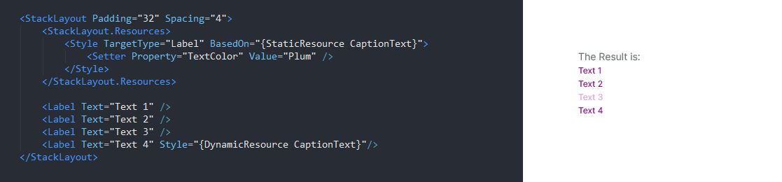
- You can use very localized ResourceDictionaries to avoid repeatedly customizing similar controls. In this example, all Labels within the StackPanel inherit the defined style.
- By not assigning an x:Key to the style, it will be used as the default style for all controls of the Label type within that StackPanel unless a Style assigned to them. This is called Implicit Styling.
- On the other hand, Labels with a Style attribute will ignore any inherited Implicit styling.
- The Implicit style will be assigned first, and will be overwritten by any defined attributes, like TextColor in this example.
- The localized Style definitions in this StackPanel will be passed down to all controls contained within it, no matter how deep the nesting goes.
- The BasedOn attribute can be used to create a sub-style based on another existing style. However, the TargetType must always match.
Content Templating

Performance
Diminishing the performance should not be the first priority but it also shouldn’t be the last. You should always think about retaining readability and consistency in your code by adding comments and using clear and significant code. But you also have to keep in mind that more code and lines mean more compiling, this can decrease the performance of your whole application. Just try to keep a good balance between these two factors in order to ease the life of customizers. They’ll surely stumble across your code in a few months and will maybe have a hard time to finalize a ten-minute task because they have to find out what every piece of code exactly does. Here are some examples which support the increase of performance.
For example:
- If you use the same resource on more than one XAML file, consider defining it in UBIKThemes (Resources Folder -> LocalState/XAML) rather than on each page.
- Don't define UI elements you don't need for composition and use the default control templates whenever possible (these templates have already been tested and verified for load performance).
Useful links for inefficient XAML code:
- https://www.codemag.com/Article/1509091/XAML-Anti-Patterns-Layout-SNAFUs
- https://docs.microsoft.com/en-us/windows/uwp/debug-test-perf/optimize-xaml-loading
Using 'NextLevel' bindings
Performance can be impacted by attempting to show multiple levels of data (ie. child data, from the parent object) outside what is delivered by UBIK by default.
For an in-depth explanation, and guidance on how to implement such functionality safely, please refer to this page Object hierarchy in XAML: NextLevel, ParentLevel, LinkedLevel.
Testing of UI
XAML can be sometimes very weird, there are dependencies or default values that you don’t see immediately. So, a good way to prevent millions of fixes for the customer, because the environment, different device or even a different windows version destroys your UI, is to write a test plan where you test your implementation. It’s important to see exactly your controls in action on their own and acting with each other, so you can prevent doing lots of ‘easy’ fixes.
- Organize UBIKThemes in sections.

