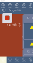
The UI is controlled by several predefined XAML templates which are loaded into the App at startup. There is a set of default template deployed with the App at installation, however, each of them can be overridden by placing the respective file in the folder [AppInstallPath]\LocalState\XAML.
Here you can see which XAML which area defines, either the area is beige colored or it has a red border around it.
Contents
General
- UBIKThemes.xaml
Controls the overall styling and behavior of the App, like standard Brushes (Colors) and Fonts.
AuthenticationPage
- UBIKSplashArea.xaml
- UBIKPageNavigation.xaml -> Deprecated and changed to UBIKHomePageButtons.xaml
- UBIKProfileItem.xaml
Content Pages
- UBIKObjectIcon.xaml
- UBIKObjectIconSmall.xaml
RootPage
- UBIKMainLeftArea.xaml
- UBIKMainItem.xaml
- UBIKMainItemSmall.xaml
ChildPage
- UBIKChildItem.xaml
- UBIKChildItemSmall.xaml
- UBIKChildArea.xaml
- UBIKChildAreaSmall.xaml
- UBIKChildAction.xaml
- UBIKPriorityPropertyItem.xaml
DetailsPage
- UBIKDocumentItem.xaml
- UBIKDocumentItemSmall.xaml


