Difference between revisions of "HowTo:Configure Start Screen Content"
(→Buttons) |
(→Buttons) |
||
| (13 intermediate revisions by 2 users not shown) | |||
| Line 3: | Line 3: | ||
== Setup == | == Setup == | ||
| − | * The first step is to configure the start screen data using an xml in order for {{UBIK}} to recognize the different tabs and buttons. The xml file, which must have the name '''css_config.xml''', should be placed | + | * The first step is to configure the start screen data using an xml in order for {{UBIK}} to recognize the different tabs and buttons. The xml file, which must have the name '''css_config.xml''', should be placed in the [[UI_Configuration_(Mobile_Client)|UI Configurations folder]]. |
| − | + | ||
| − | + | ||
| − | + | ||
| − | + | ||
| − | + | ||
| − | | | + | |
| − | + | ||
| − | + | ||
* After the folder is configured, the next step is to validate the XML configuration file against the [http://wiki.augmensys.com/index.php/File:Start_Screen_Configuration_Schema.zip schema] using an online validator. A solution can be found at [http://www.utilities-online.info/xsdvalidation/ Online XML Schema Validator]. | * After the folder is configured, the next step is to validate the XML configuration file against the [http://wiki.augmensys.com/index.php/File:Start_Screen_Configuration_Schema.zip schema] using an online validator. A solution can be found at [http://www.utilities-online.info/xsdvalidation/ Online XML Schema Validator]. | ||
| − | The following xml shows an example configuration (also can be downloaded as | + | The following xml shows an example configuration (also can be downloaded as {{FileLink|Start_Screen_Configuration.zip|Start_Screen_Configuration.zip}} an xml file): |
<source lang="xml"> | <source lang="xml"> | ||
<StartScreenConfiguration> | <StartScreenConfiguration> | ||
| Line 57: | Line 49: | ||
{{Hint|The config file has to be named '''css_config.xml'''. }} | {{Hint|The config file has to be named '''css_config.xml'''. }} | ||
| + | |||
== Tab groups == | == Tab groups == | ||
| Line 74: | Line 67: | ||
<gallery heights="100"> | <gallery heights="100"> | ||
File:UI_Android_CSS_Buttons_Content_Browser.jpg|Content Browser Button | File:UI_Android_CSS_Buttons_Content_Browser.jpg|Content Browser Button | ||
| − | + | File:UI_Android_CSS_Buttons_Custom_Intent.png|Custom Intent Button | |
| − | File:UI_Android_CSS_Buttons_Custom_Intent. | + | |
File:UI_Android_CSS_Buttons_Maps.jpg|Maps Button | File:UI_Android_CSS_Buttons_Maps.jpg|Maps Button | ||
File:UI_Android_CSS_Buttons_Maps.jpg|Target Maps Button | File:UI_Android_CSS_Buttons_Maps.jpg|Target Maps Button | ||
| Line 87: | Line 79: | ||
File:UI_Android_CSS_Buttons_Barcode.png|Barcode Scan Button | File:UI_Android_CSS_Buttons_Barcode.png|Barcode Scan Button | ||
File:UI_Android_CSS_Buttons_RFID_Scan.jpg|RFID Scan Button | File:UI_Android_CSS_Buttons_RFID_Scan.jpg|RFID Scan Button | ||
| + | File:UI_Android_CSS_Buttons_OCR_Scan.png|OCR Scan Button {{Version/AndroidSince|2.5.0}} | ||
</gallery> | </gallery> | ||
| Line 119: | Line 112: | ||
|- | |- | ||
| ''RFIDScanButton''|| Starts RFID scanning. || - | | ''RFIDScanButton''|| Starts RFID scanning. || - | ||
| + | |- | ||
| + | | ''OCRScanButton''|| Starts OCR scanning. {{Version/AndroidSince|2.5.0}} || - | ||
|} | |} | ||
| + | |||
| + | === Color of Buttons === | ||
| + | |||
| + | If no user is logged in the buttons are de-saturated. Once a user is logged in the buttons are colored according to following behaviour: | ||
| + | * If default buttons are used the buttons are colored programmatically. The button and the color can be customized by the Development. | ||
| + | * If custom buttons are used (specified by the parameter "iconPath") the original color of the button is retained. | ||
| + | |||
| + | [[Category:Android|Configure Start Screen Content]] | ||
| + | [[Category:How-To|Configure Start Screen Content]] | ||
| + | [[Category:Publishing|Configure Start Screen Content]] | ||
== Configuration guidelines == | == Configuration guidelines == | ||
| + | |||
| + | * See [[UI_Configuration_(Mobile_Client)]] | ||
* The '''maximum number of tabs is 6'''. Once this limit is exceeded, the configuration is invalid and won't be shown. | * The '''maximum number of tabs is 6'''. Once this limit is exceeded, the configuration is invalid and won't be shown. | ||
* The captions of tabs are optional. In case there's only one tab, the tab will be invisible. | * The captions of tabs are optional. In case there's only one tab, the tab will be invisible. | ||
| Line 128: | Line 135: | ||
* While configuring the [[Custom Intent Button|custom intent button]], one should always specify one and only one of the target class and the target URI. Otherwise, the button is invalid and an error will be shown. | * While configuring the [[Custom Intent Button|custom intent button]], one should always specify one and only one of the target class and the target URI. Otherwise, the button is invalid and an error will be shown. | ||
* The configuration of the ''UBIK-UID'' parameter should always be specified for AR Navigation POI View Button, AR Navigation Maps Button, Demo Maps Button and Target Maps Button. | * The configuration of the ''UBIK-UID'' parameter should always be specified for AR Navigation POI View Button, AR Navigation Maps Button, Demo Maps Button and Target Maps Button. | ||
| + | |||
| + | |||
| + | {{Attention|The configuration is only applied when the app starts. Close the app completely (not only move it to the background) and restart it to make sure the configuration is read.}} | ||
| + | |||
== Results == | == Results == | ||
| Line 141: | Line 152: | ||
== See also == | == See also == | ||
| + | * [[UI_Configuration_(Mobile_Client)]] | ||
* [[Custom_Intent_Button]] | * [[Custom_Intent_Button]] | ||
| − | [[Category: | + | [[Category:Android|Configure Start Screen Content]] |
| − | [[Category: | + | [[Category:How-To|Configure Start Screen Content]] |
| − | [[Category: | + | [[Category:Publishing|Configure Start Screen Content]] |
Latest revision as of 09:18, 31 August 2016
Contents
Introduction
The Dynamic Configurable start screen feature allows the UBIK® user to tailor the buttons on the start screen according to the needs of the customer.
Setup
- The first step is to configure the start screen data using an xml in order for UBIK® to recognize the different tabs and buttons. The xml file, which must have the name css_config.xml, should be placed in the UI Configurations folder.
- After the folder is configured, the next step is to validate the XML configuration file against the schema using an online validator. A solution can be found at Online XML Schema Validator.
The following xml shows an example configuration (also can be downloaded as ![]() Start_Screen_Configuration.zip an xml file):
Start_Screen_Configuration.zip an xml file):
<Tab caption="Content">
<ContentBrowserButton caption="Content Browser"/>
<ContentBrowserButton caption="Events" UBIK-UID="31aaa5c9-85dd-4243-9cf8-89d712d32405" iconPath="events.png"/>
</Tab>
<Tab caption="AR1">
<MapsButton/>
<POIViewButton caption="AR View"/>
<CustomIntentButton caption="Map of Linz" iconPath="linz.png">
<TargetURI>
https://www.google.com/maps/place/Linz/@48.295065,14.327405,12z/data=!3m1!4b1!4m2!3m1!1s0x47739595fa99854d:0x7c53292c577975c4
</TargetURI>
</CustomIntentButton>
<CustomIntentButton caption="Skype">
<TargetClass>
com.skype.raider.Main
</TargetClass>
</CustomIntentButton>
<CustomIntentButton caption="Maps">
<TargetClass>
com.augmensys.ubik.demo.lib.ui.activities.ar.map.UBIKMapActivityDemo
</TargetClass>
</CustomIntentButton>
<TargetMapsButton caption="Flow Controller 213" UBIK-UID="2ccd91c0-9cee-42f3-9d1d-be745908457d"/>
</Tab>
<Tab caption="AR2">
<IDMarkerScanButton caption="ID Marker Scan"/>
<QRCodeScanButton caption="QR Code Scan"/>
<ConfigurableARButton caption="Configurable AR"/>
<ConfigurableImageMarkerButton caption="Configurable Image Marker"/>
<ARNavigationButton caption="Flow Controller 213" UBIK-UID="2ccd91c0-9cee-42f3-9d1d-be745908457d"/>
<NavigationMapsButton caption="Flow Controller 213" UBIK-UID="2ccd91c0-9cee-42f3-9d1d-be745908457d"/>
<DemoMapsButton caption="Flow Controller 213" UBIK-UID="2ccd91c0-9cee-42f3-9d1d-be745908457d"/>
<RFIDScanButton caption="RFID Scan" />
</Tab>
</StartScreenConfiguration>
Tab groups
The user can configure tab groups in the XML. They will be used as groupings for buttons.
Buttons
Buttons should be placed inside tab elements and can be parameterized. Buttons are configurable in terms of
- Icon (Parameter: iconPath)
- Caption (Parameter: caption)
- Group/tab (name of tab group)
- Object UID if needed (Parameter: UBIK-UID)
| The icons are specified by their relative paths under SD_CARD/Android/data/APP_PACKAGE_NAME/files/UIConfigurations/CSSButtonIcons |
The supported button types are as follows:
| Button | Purpose | Parameters |
|---|---|---|
| ContentBrowserButton | Opens a content browser for displaying an object or the root if no object/uid is specified. | UBIK-UID: UID of object to be shown on map |
| CustomIntentButton | Launches a certain application or URI for the specified intent (using a customized intent URI or target class). | TargetClass: name of an activity or an application TargetURI: link information |
| MapsButton | Opens UBIK® map. | - |
| TargetMapsButton | Opens UBIK® map for a target object. | UBIK-UID: UID of object to be shown on map |
| ID MarkerScanButton | Starts ID marker scanning. | - |
| QRScanButton | Starts QR code scanning. | - |
| POIViewButton | Opens UBIK® POI view. | - |
| ConfigurableARButton | Opens the ID marker 3D view. | - |
| ConfigurableImageMarkerButton | Opens the markerless view. | - |
| ARNavigationPOIViewButton | Opens UBIK® POI view with the AR navigation support. | UBIK-UID: UID of object to be navigated to |
| ARNavigationMapsButton | Opens UBIK® map for the specified object.Starts navigating to the specified object. | UBIK-UID: UID of object to be navigated to |
| BarcodeScanButton | Starts barcode scanning. | - |
| RFIDScanButton | Starts RFID scanning. | - |
| OCRScanButton | Starts OCR scanning. | - |
Color of Buttons
If no user is logged in the buttons are de-saturated. Once a user is logged in the buttons are colored according to following behaviour:
- If default buttons are used the buttons are colored programmatically. The button and the color can be customized by the Development.
- If custom buttons are used (specified by the parameter "iconPath") the original color of the button is retained.
Configuration guidelines
- See UI Configuration (Mobile Client)
- The maximum number of tabs is 6. Once this limit is exceeded, the configuration is invalid and won't be shown.
- The captions of tabs are optional. In case there's only one tab, the tab will be invisible.
- The buttons should always be nested inside tabs. Otherwise, the configuration is also invalid.
- Captions and icons of buttons are optional. Default values are used for the unspecified ones.
- While configuring the custom intent button, one should always specify one and only one of the target class and the target URI. Otherwise, the button is invalid and an error will be shown.
- The configuration of the UBIK-UID parameter should always be specified for AR Navigation POI View Button, AR Navigation Maps Button, Demo Maps Button and Target Maps Button.
| The configuration is only applied when the app starts. Close the app completely (not only move it to the background) and restart it to make sure the configuration is read. |
Results
The result is that the tabs and buttons configured in the XML file will be visible and open the right activity once they are clicked.
The following screenshots demonstrate the results of the example XML configuration.
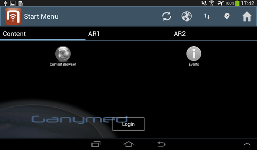
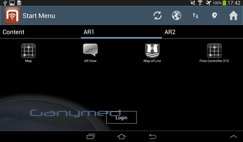
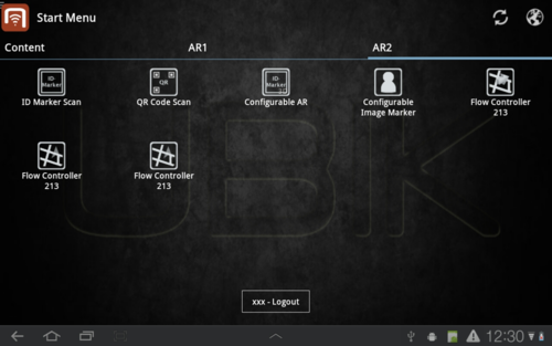
After users log in, the buttons are enabled and colored. Upon being clicked, they should trigger different actions.


