Difference between revisions of "UBIK Templates"
(→RootPage) |
(→RootPage) |
||
| Line 41: | Line 41: | ||
*UBIKMainArea.xaml | *UBIKMainArea.xaml | ||
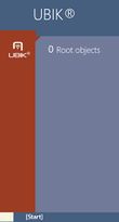
[[File:MainAreaA.JPG|upright=0.35|thumb|left|alt=UBIKMainArea|UBIKMainArea.xaml]] | [[File:MainAreaA.JPG|upright=0.35|thumb|left|alt=UBIKMainArea|UBIKMainArea.xaml]] | ||
| + | {{clear}} | ||
| + | *UBIKMainPageListHeader.xaml | ||
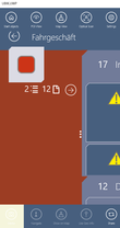
| + | [[File:MainPageListHeader.png|upright=0.35|thumb|left|alt=UBIKMainPageListHeader|UBIKMainPageListHeader.xaml]] | ||
{{clear}} | {{clear}} | ||
Revision as of 06:47, 26 July 2017
The UI is controlled by several predefined XAML templates which are loaded into the App at startup. There is a set of default template deployed with the App at installation, however, each of them can be overridden by placing the respective file in the folder [AppInstallPath]\LocalState\XAML.
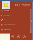
Here you can see which XAML which area defines, either the area is beige colored or it has a red border around it.
Contents
General
- UBIKThemes.xaml
Controls the overall styling and behavior of the App, like standard Brushes (Colors) and Fonts.
AuthenticationPage
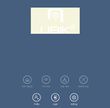
- UBIKSplashArea.xaml
- UBIKProfileItem.xaml
Content Pages
- UBIKObjectIcon.xaml
- UBIKObjectIconSmall.xaml
- UBIKBottomLeft.xaml
RootPage
- UBIKMainLeftArea.xaml
- UBIKMainItem.xaml
- UBIKMainItemSmall.xaml
- UBIKMainArea.xaml
- UBIKMainPageListHeader.xaml
ChildPage
- UBIKChildItem.xaml
- UBIKChildItemSmall.xaml
- UBIKChildArea.xaml
- UBIKChildAreaSmall.xaml
- UBIKChildAction.xaml
- UBIKPriorityPropertyItem.xaml
- UBIKChildPageAction.xaml
DetailsPage
- UBIKDocumentItem.xaml
- UBIKDocumentItemSmall.xaml
MapView
- UBIKCustomMapPin


