We have provided a default chart template that can be used anywhere. In our standard application, a chart is visible when clicking a Chart type property in the property list. A dialog will show up, displaying the chart. The chart can be further extended by customizing UBIKChart.xaml. However, we have made sure to support complex data structures from the chart, and to allow for most of the custom presentation data to come from the server side.
Chart properties
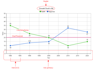
The chart receives its data from a property containing a ChartData object. This object is packed with customizable data that the chart template binds to. This data is received from the server. However, you may also customize the chart template to your liking to override certain values. The image on the right can help clarify some of these properties.
Here is a breakdown of all the date, and how it is represented in the UI:
ChartData
- Header (string): title of the chart
- PrimaryAxis (ChartAxis): the X-axis
- SecondaryAxis (ChartAxis): the Y-axis
- Series (list of ChartValueSeries): all line series visible on the chart
- Thresholds (list of ChartThreshold): all horizontal thresholds visible on the chart
ChartAxis
- Header (string): the label of the axis
- Interval (double): the interval between gridlines on the axis
- DateTimeIntervalType (int): the interval type in case of a date axis. The following values are possible:
- Auto = 0,
- Milliseconds = 1,
- Seconds = 2,
- Minutes = 3,
- Hours = 4,
- Days = 5,
- Months = 6,
- Years = 7
- LabelFormat (string): the format string to define how value labels are formatted. See Label formatting
- Minimum (object): the minimum value to display on the axis
- Maximum (object): the maximum value to display on the axis
ChartValueSeries
- Name (string): the name of the series (will be shown in the legend)
- Color (int): the color of the line
- Items (list of ChartItem): the list of data points on the line
ChartItem
- XValue (object): the X value of the data point
- YValue (object): the Y value of the data point
ChartThreshold
- Value (object): the value of the threshold (on the Y-axis)
- Color (int): the color of the threshold line
Label formatting
The ChartAxis object contains a property "LabelFormat" that allows you to customize how the value labels on the axes are presented. This special format string only applies to numbers and dates. Some examples of what you could do what the format string:
| Input | Format string | Output |
|---|---|---|
| 5.5 | "##.000" | 5.500 |
| 01/05/2017 16:00:00 | "yyyy" | 2017 |
| 01/05/2017 16:00:00 | "dd/MM/yyyy" | 01-05-2017 |
See here for how to format numeric objects, and here for how to format dates.
Interactivity
You can zoom in on the chart by using the pinch zoom gesture on touch-screen devices, or by using the scroll wheel on your mouse. After zooming, you can pan around the chart by simply pressing and dragging. Note that for larger data sets, the performance might suffer when zooming and panning.
Using a Chart
A chart can be used by creating a custom meta property of type Chart and assigning it to a MetaClass via the RelationEditor. An object of type ChartData can be assigned to this property.
Xamarin Chart Customizing
Since Client Version 4.8 it is also supported for Xamarin to customize charts. As there is currently no standard Chart xaml, it needs to be customized in any existing xaml, e.g. in UBIKPropertyArea. To achieve that, the following Resources and a Chart control should be created.
Resources
Axis Templates
Templates for the Numeric, Category, and DateTime Axis, including bindings to the related ChartAxis properties, must be added to the Resources as defined in the example below.
Template Selectors
The templates should be referred to in the PrimaryAxisTemplateSelector and ChartAxisTemplateSelector, which must also be defined in the Resources. The boolean IsPrimaryAxis determines whether it's the primary or secondary axis.
Converter
The IntToDateTimeIntervalConverter should be added to the ReourceDisctionary to use it in the DateTimeAxisTemplate for a proper conversion of the integer provided by the server to a DateTimeIntervalType that can be processed by the Syncfusion Chart control.
| Make sure to use the proper BindingContext, namely the Value of the related Chart property. It is recommended to use it e.g. on the parent Grid containing all Chart related code. |
<ResourceDictionary>
<converters:IntToDateTimeIntervalConverter x:Key="IntToDateTimeInterval" />
....
</ResourceDictionary>
<Grid.Resources>
<!-- Templates for axis types -->
<DataTemplate x:Key="NumericAxisTemplate">
<chart:NumericalAxis
Interval="{Binding Interval}"
Maximum="{Binding Maximum}"
Minimum="{Binding Minimum}" >
<chart:NumericalAxis.LabelStyle>
<chart:ChartAxisLabelStyle LabelFormat="{Binding LabelFormat}"/>
</chart:NumericalAxis.LabelStyle>
<chart:NumericalAxis.Title>
<chart:ChartAxisTitle Text="{Binding Header}"/>
</chart:NumericalAxis.Title>
</chart:NumericalAxis>
</DataTemplate>
<DataTemplate x:Key="CategoryAxisTemplate">
<chart:CategoryAxis
Interval="{Binding Interval}">
<chart:CategoryAxis.Title>
<chart:ChartAxisTitle Text="{Binding Header}"/>
</chart:CategoryAxis.Title>
<chart:CategoryAxis.LabelStyle>
<chart:ChartAxisLabelStyle LabelFormat="{Binding LabelFormat}"/>
</chart:CategoryAxis.LabelStyle>
</chart:CategoryAxis>
</DataTemplate>
<DataTemplate x:Key="DateTimeAxisTemplate">
<chart:DateTimeAxis
Interval="{Binding Interval}"
IntervalType="{Binding DateTimeIntervalType, Converter={StaticResource IntToDateTimeInterval}}"
Maximum="{Binding Maximum}"
Minimum="{Binding Minimum}" >
<chart:DateTimeAxis.Title>
<chart:ChartAxisTitle Text="{Binding Header}"/>
</chart:DateTimeAxis.Title>
<chart:DateTimeAxis.LabelStyle>
<chart:ChartAxisLabelStyle LabelFormat="{Binding LabelFormat}"/>
</chart:DateTimeAxis.LabelStyle>
</chart:DateTimeAxis>
</DataTemplate>
<!-- Axis template selectors -->
<resources:ChartAxisTemplateSelector
x:Key="PrimaryAxisTemplateSelector"
CategoryAxisTemplate="{StaticResource CategoryAxisTemplate}"
DateTimeAxisTemplate="{StaticResource DateTimeAxisTemplate}"
IsPrimaryAxis="True"
NumericAxisTemplate="{StaticResource NumericAxisTemplate}" />
<resources:ChartAxisTemplateSelector
x:Key="SecondaryAxisTemplateSelector"
CategoryAxisTemplate="{StaticResource CategoryAxisTemplate}"
DateTimeAxisTemplate="{StaticResource DateTimeAxisTemplate}"
IsPrimaryAxis="False"
NumericAxisTemplate="{StaticResource NumericAxisTemplate}" />
</Grid.Resources>
Chart control
To display the Chart itself and to use the resources defined above, an extended Chart control is required with bindings to the Primary and Secondary Axis Template Selectors, Series, and Thresholds ChartData properties. Additionally, Series and StripLines templates are needed. They can be added to the chart control using fitting Syncfusion components with related Chart properties as bindings, as defined in the example below. For more information and examples, please refer to the Syncfusion Xamarin Charts documentation.
xmlns:controls="clr-namespace:UBIK.CPL.Controls;assembly=UBIK.CPL"
<controls:SfChartExt
x:Name="Chart"
PrimaryAxisTemplateSelector="{StaticResource PrimaryAxisTemplateSelector}"
SecondaryAxisTemplateSelector="{StaticResource SecondaryAxisTemplateSelector}"
SeriesSource="{Binding Series}"
StripLinesSource="{Binding Thresholds}">
<chart:SfChart.Title>
<chart:ChartTitle Text="{Binding Header}" />
</chart:SfChart.Title>
<controls:SfChartExt.StripLinesTemplate>
<DataTemplate>
<chart:NumericalStripLine
Width="2"
StrokeColor="{Binding Color, Converter={StaticResource IntToColor}}"
IsPixelWidth="True"
StrokeWidth="5"
Start="{Binding Value}" />
</DataTemplate>
</controls:SfChartExt.StripLinesTemplate>
<controls:SfChartExt.SeriesTemplate>
<DataTemplate>
<chart:FastLineSeries
ItemsSource="{Binding Items}"
Label="{Binding Name}"
Color="{Binding Color, Converter={StaticResource IntToColor}}"
XBindingPath="XValue"
YBindingPath="YValue">
</chart:FastLineSeries>
</DataTemplate>
</controls:SfChartExt.SeriesTemplate>
<chart:SfChart.Legend>
<chart:ChartLegend />
</chart:SfChart.Legend>
<chart:SfChart.ChartBehaviors>
<chart:ChartZoomPanBehavior />
</chart:SfChart.ChartBehaviors>
</controls:SfChartExt>


