The User Interface of the Xamarin Clients (Android, iOS, new UWP) can be fundamentally customized using custom XAML definitions. This customization process is heavily influenced by the XAML Customization Process on the WinX Client.
Contents
Basics
There are predefined XAML templates available that can be overridden. If no override is found, the default template will be used.
Overrides need to be placed in the following folder:
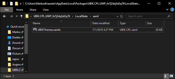
[App Installation Path]/LocalState/xaml/ (on Windows)
A list of predefined templates (all starting with UBIK) can be overwritten. The overrides will be loaded during the startup of the app.
Important
Make sure to change the extension to xamlx to achieve the desired loading and overriding behavior!
UBIKThemes.xamlx
One of the most significant files is the UBIKThemes.xamlx, as it is the place to override and extend global definitions. Definitions and changes made here will reflect over all templates and subtemplates of the app.
After adapting the UBIKThemes file, the app needs to be restarted to update the changes.
Overriding Styles
The steps shown here just work for the Windows (UWP) build of the Xamarin app. The LocalState folder can be accessed by the user and the customized xaml files directly added. On other systems (Android, iOS, etc.), you can use the Import Customizing button in the Settings to import the styles and images (file by file, for now). In both cases, the program needs to be restarted after the files have been imported/changed.
In the following, we're going to override the Foreground Color of the program:
- Download the following file: UBIKThemes.zip
- Unzip it and place it into the xaml folder inside the LocalState folder:
- Open it with the text editor of your choice and add the following definition:
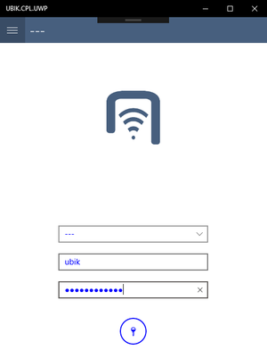
- Save the changes and restart UBIK. You should see changes successfully implemented:
Custom Templates
Custom templates can be added, just like on the WinX client. Make sure to save the file as xamlx and include all namespace definitions (as attributes of the ContentView tag), otherwise the custom template will not load.
Similar to the UBIKThemes.xamlx file, custom or overridden templates start with a <ContentView> tag containing all namespaces. <ContentView.Resources> takes a ResourceDictionary and contains resources like references to converters. Finally, <ContentView.Content> contains the actual layout content (it's best to start with a Grid). Again, don't forget to add namespaces that you need!
Templates can also be defined in UBIKThemes.xamlx. In this case, they need to be added into the <ResourceDictionary> inside the <ContentView.Resources> template as a <DataTemplate>. Similarly, if you want to split up the templates into seperate files, you need to make sure to follow the steps mentioned above and get the content of the <DataTemplate> into the <ContentView.Content> tag. Templates defined in the UBIKThemes.xamlx override templates defined in seperate files!
Adding Images
Images can't be loaded with the default Image tag, as the image is on different paths on each operating system.
Therefore, there's a custom FileImage that internally overrides the default Image with two custom parameters:
- FolderName ...The name of the folder in the local folder. Only the first level inside the LocalState folder seems to work.
- FileName ...The name of the file in the said folder.
Make sure to implement the proper namespace as well by adding
xmlns:fimage="clr-namespace:UBIK.CPL.Controls;assembly=UBIK.CPL" into the root item's attributes.
Then, the image can be loaded using:
<fimage:FileImage FileName="image.png" FolderName="xaml"/>
This snipped loads the image called image.png located in the xaml folder inside the LocalState.
Furthermore, the FileImage tag doesn't seem to support most attributes. Therefore place it inside a Grid to achieve a perfect layout.
Converters
- Main Page: Converters In Xamarin
They are used to convert specific data into some desired output, using custom logic.
Consider the following example:
A label saying There are no children items available! should only be visible if the number of children-items is 0.
Differences to WinX
The biggest difference is that developers don't need to copy the whole UBIKThemes.xamlx file just to edit a few styles. Just the changes from the default styles (soon to be available on the [Release Portal]) need to be defined in the overwritten file!
Other changes include:
- Namespace definitions have to be included in all files.
- Because the same styles are used on different devices (mobile phones, PCs, tablets), responsive user interfaces should be designed.
Advanced
Performance
To get a good performance in the app UI when using your Xaml customizings, it is recommended to try the following.
- Always keep your UI structure simple. Choose the most efficient layouts for the scenarios and avoid unnecessary UI elements. Please refer to "choose the correct layout" and "reduce the visual tree size";
- Turn on layout compression on wrapping elements that don't have any visual parameters set (reasons stated in the linked documentation).
| If possible, one should always favor designing the UI with less wrapping elements over turning on layout compression on unnecessary ones. |
Layout compression examples
The code above removes one wrapping element added automatically by the ContentView and demonstrates a good reason to use layout compression because it can not be avoided otherwise.
<Label Margin="5" Text="{Binding Title}" />
</Grid>
This example, on the other hand, demonstrates a bad usage of layout compression because it can be easily achieved by better designs such as using only the Label with a merged margin.
Sometimes the content inside a compressed layout appears on a wrong z-index level. For eample:
<ContentView ControlTemplate="{DynamicResource Badge}" Style="{DynamicResource HeadlessLayout}">
<Label Text="{Binding Title}" />
</ContentView >
According to the order of the BoxView and the Label, the latter should appear on top of the former (later ones have higher z-index levels). However, this can be disturbed by layout compression, causing the exact opposite.
In this case, you can add a xmlns:android="clr-namespace:Xamarin.Forms.PlatformConfiguration.AndroidSpecific;assembly=Xamarin.Forms.Core" namespace to your Xaml file and manually elevate the Label by specifying android:VisualElement.Elevation="X" on it accordingly (X is the delta of the z-index level you want).

