(→Overview) |
|||
| (27 intermediate revisions by 5 users not shown) | |||
| Line 1: | Line 1: | ||
== Overview == | == Overview == | ||
The developer mode provides certain features to help customizing the {{UBIK}} UI and is therefore only meant to be accessed by project engineers and developers. | The developer mode provides certain features to help customizing the {{UBIK}} UI and is therefore only meant to be accessed by project engineers and developers. | ||
| + | |||
| + | {{Attention|{{Version/XamarinSince|4.3}}The Mobile clients generally don't support the developer mode due to the size restriction of the devices. On Mobile Windows, only the most basic functionality is available, namely you can activate the mode to see the different UI fragments being represented as those similar green boxes with respective template names.}} | ||
| + | |||
| + | [[Category:Client|Developer Mode]] | ||
| + | [[Category:Mobile|Developer Mode]] | ||
| + | [[Category:WinX|Developer Mode]] | ||
| + | [[Category:XAML|Developer Mode]] | ||
== Stages == | == Stages == | ||
| − | The developer mode can be reached by hitting {{key press|F12}}. When hit for the first time, developer mode is in Stage 1, when hit again it will be in Stage 2. When hit for the third time, developer mode is switched off again (Stage 0). | + | The developer mode can be reached by hitting {{key press|F12}} / {{key press|Ctrl}}+{{key press|F12}}{{Version/WinXSince|3.6}}. When hit for the first time, developer mode is in Stage 1, when hit again it will be in Stage 2. When hit for the third time, developer mode is switched off again (Stage 0). |
=== Stage 1 === | === Stage 1 === | ||
| Line 10: | Line 17: | ||
=== Stage 2 === | === Stage 2 === | ||
The area templates will be highlighted; if there are lists currently displayed, its item templates will not be visible. | The area templates will be highlighted; if there are lists currently displayed, its item templates will not be visible. | ||
| + | |||
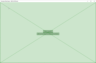
| + | === Stage 3 {{Version/WinXSince|3.6}} === | ||
| + | The template of the whole page will be highlighted (Only available on some pages, e.g. ChildPage) | ||
{| class="wikitable" | width = "100%" style="text-align: center;" | {| class="wikitable" | width = "100%" style="text-align: center;" | ||
|- | |- | ||
| − | ! Stage 1 !! Stage 2 !! Stage 0 (non-developer mode) | + | ! Stage 1 !! Stage 2 !! Stage 3 !! Stage 0 (non-developer mode) |
|- | |- | ||
| − | | [[File: | + | | [[File:Stage 1.png|335x230px]] || [[File:Stage 2.png|335x230px]] || [[File:Stage 3.png|335x230px]] || [[File:Stage 0.png|335x230px]] |
|} | |} | ||
| + | <br /> | ||
| + | {{Hint|The current stage information is shown in the app's title. For certain pages, there might be no differences at all between some stages. For example, the login page looks exactly the same between stage 1 and stage 2 since there's no list items to display.}} | ||
== Features == | == Features == | ||
[[File:UBIK_WinX_UI_DeveloperMode_Template_Button.png|thumb|Template button and its flyout]] | [[File:UBIK_WinX_UI_DeveloperMode_Template_Button.png|thumb|Template button and its flyout]] | ||
[[File:UBIK_WinX_UI_DeveloperMode_ConText_Button.png|thumb|Context button and its flyout]] | [[File:UBIK_WinX_UI_DeveloperMode_ConText_Button.png|thumb|Context button and its flyout]] | ||
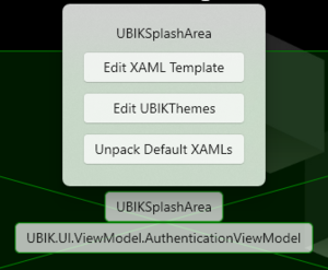
| − | In developer mode, all templates on a certain page will be highlighted as a crossed-out green area with two buttons. The top button allows to edit the XAML file behind the respective area, and the bottom button allows to browse the properties, methods and commands of the underlying ViewModel/Context. | + | In developer mode, all templates on a certain page will be highlighted as a crossed-out green area with two buttons. The top/template button allows to edit the XAML file behind the respective area, and the bottom/context button allows to browse the properties, methods and commands of the underlying ViewModel/Context. |
=== XAML Files === | === XAML Files === | ||
| − | When pressing | + | When pressing {{key press|Edit XAML Template}} in the flyout with the name of the XAML file, the following will happen: |
| − | * If this template doesn't have a customized XAML file yet, {{UBIK}} will copy its default XAML definition into the customizing folder, open the explorer and highlight it | + | * If this template doesn't have a customized XAML file yet, {{UBIK}} will copy its default XAML definition into the customizing folder, open the explorer and highlight it. From there you can use any text editor to modify it; |
* If there is already a customized XAML file for this template, UBIK will ask whether you want to open the existing file or if you want to replace the existing file with the default XAML definition of this template again. | * If there is already a customized XAML file for this template, UBIK will ask whether you want to open the existing file or if you want to replace the existing file with the default XAML definition of this template again. | ||
| + | |||
| + | {{Hint|If you switch on developer mode stage 2 on a page where a [[SYSCLS_CHILDAREATEMPLATE|custom child area template]] is used, that custom name is displayed instead of the default "UBIKChildArea" text.}} | ||
| + | |||
| + | {{Version/WinXSince|3.6}} When pressing {{key press|Edit UBIKThemes}} in the same flyout, {{UBIK}} presents the same options. Except it deals with the UBIKThemes.xaml file instead of the various template files. | ||
| + | |||
| + | {{Hint|This button is accessible in any template button flyout and is a convenient way to get the most up-to-date default version of the UBIKThemes.xaml file.}} | ||
| + | |||
| + | {{Version/WinXSince|4.0}} When pressing {{key press|Unpack Default XAMLs}} in the same flyout, {{UBIK}} places all default XAML files under the app's "LocalState\XAML\default" folder, overwriting any if already exists. This is provided as a last approach to fetch any default XAML template. We recommend using {{key press|Edit XAML Template}} first if you can since that is more context relevant and places the template in the right folder for you to start your customizing. | ||
| + | |||
| + | |||
| + | |||
=== Browsing the ViewModel/Context === | === Browsing the ViewModel/Context === | ||
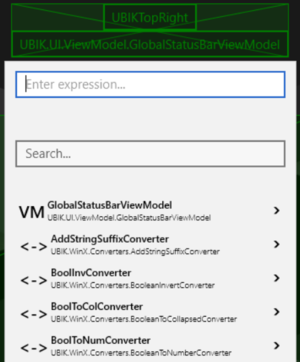
| − | When pressing the button with the name of the ViewModel/Context, {{UBIK}} will open a browser that allows you to explore all | + | When pressing the button with the name of the ViewModel/Context, {{UBIK}} will open a browser that allows you to explore all its public properties, methods and commands. |
| − | * If the member is a property {{key press|P}} or method {{key press|M}} , its path will be copied to the expression field on top of the browser and its result will be instantly evaluated | + | |
| − | * If the member is a command {{key press|C}} the browser will navigate to its respective Execute method. Tapping the button of the Execute method will invoke the command | + | {{Hint|At the root level, a complete and up-to-date list of converters is also displayed. Their names/keys, which you should use in XAML customizings, are displayed in the first rows.}} |
| + | |||
| + | Tapping on a member will pin that member and browse a level deeper. Tapping on the button on the left side of the member name, will trigger the following: | ||
| + | * If the member is a property {{key press|P}}, an indexer {{key press|I}} or method {{key press|M}} , its path will be copied to the expression field on top of the browser and its result will be instantly evaluated; | ||
| + | * If the member is a command {{key press|C}} the browser will navigate to its respective Execute method. Tapping the button of the Execute method will invoke the command. | ||
| + | |||
| + | {{Hint|The result of clicking on an indexer (both button and row) is slightly different in its category, namely the evaluation and browsing all target the type(s) of the collection items instead of the collection itself.}} | ||
Here is a list of all possible member types. | Here is a list of all possible member types. | ||
| − | {| class="wikitable" | width = " | + | {| class="wikitable" | width = "60%" style="text-align: left;" |
| − | |- | + | |- style="vertical-align: top;" |
| − | | Converter || [[File:UI_WinX_DeveloperMode_Converter.png| | + | | Converter || [[File:UI_WinX_DeveloperMode_Converter.png|300x42px]] || All converters that can be used in the current XAML context. They are only displayed at the top level. |
| − | |- | + | |- style="vertical-align: top;" |
| − | | Property || [[File:UI_WinX_DeveloperMode_Property.png| | + | | Obsolete || [[File:UI_WinX_DeveloperMode_Obsolete.png|300x42px]] || All members marked red are obsolete and recommended not to be used anymore. |
| − | |- | + | |- style="vertical-align: top;" |
| − | | Method || [[File:UI_WinX_DeveloperMode_Method.png| | + | | Property || [[File:UI_WinX_DeveloperMode_Property.png|300x42px]] || Public properties that can be inspected. |
| − | |- | + | |- style="vertical-align: top;" |
| − | | | + | | Method || [[File:UI_WinX_DeveloperMode_Method.png|300x42px]] || Includes both the command related methods and all other public methods. |
| − | |- | + | |- style="vertical-align: top;" |
| − | | | + | | Indexer {{Version/WinXSince|4.0}} || [[File:UI_WinX_DeveloperMode_Indexer.png|300x42px]] || Unique to collection types, uses syntax [''indexer''] to evaluate a single item of the collection. |
| + | |- style="vertical-align: top;" | ||
| + | | Command || [[File:UI_WinX_DeveloperMode_Command.png|300x42px]] || Performs a certain task, e.g. navigating back to the previous page, taking a picture. Every one of them has a corresponding "Execute''[CommandName]''" method which actually executes the command. | ||
|} | |} | ||
| + | |||
| + | {{Hint|You can hover over a member in the list to get more information such as its description, usage, hints, etc. | ||
| + | * When hovering over an obsolete member, you will find a suggested replacement.}} | ||
[[File:UI_WinX_DeveloperMode_Example.png|thumb|An example of searching & evaluating]] | [[File:UI_WinX_DeveloperMode_Example.png|thumb|An example of searching & evaluating]] | ||
==== Search field ==== | ==== Search field ==== | ||
| + | The second text field (the one that says "Search...") in the browser can be used as a filter to reduce the number of members displayed in the list. | ||
| + | * The search occurs as you type and the search text is '''case insensitive'''; | ||
| + | * Only members whose names contain the entered search text are shown in the list; | ||
| + | * The already pinned members are not filtered. | ||
==== Expression field ==== | ==== Expression field ==== | ||
| − | The | + | The text field on top (the one that says "Enter expression...") allows direct input of an expression to be evaluated. |
| + | * The evaluation occurs as you type and the expression text is '''case sensitive'''; | ||
| + | * The context used for evaluating the expression does not change as you browse further into the list; | ||
| + | * The result of the evaluation (if there is any and it's not null) is displayed below the expression field. | ||
| + | |||
| + | [[File:UI_WinX_DeveloperMode_PinContext.png|thumb|An expression result that can be pinned as the new data context]] | ||
| + | [[File:UI_WinX_DeveloperMode_UnpinContext.png|thumb|A pinned data context]] | ||
| + | ==== Pinning a new context {{Version/WinXSince|4.0}} ==== | ||
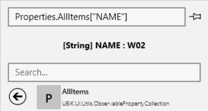
| + | Sometimes it is better to jump start with a specific binding data context instead of one that can be found in the standard UI. For example, while the default data context of a child page is a ContentPageViewModel, the inspection of its <code>Properties.AllItems["NAME"]</code> might be needed more frequently. | ||
| + | |||
| + | In such cases, you can evaluate the expression first. If the evaluation is successful, a pin button should appear on the right side. Once pinned, the type of the evaluated result becomes the new binding data context of the type browser and you can start browsing into that type directly. The expression of the pinned context is displayed on the left side of the expression field, alongside a button to unpin it. | ||
| + | |||
| + | ==== Usage example ==== | ||
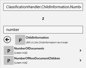
| + | An example is shown in the picture. The template involved is UBIKChildArea and the context is a ContentPageViewModel. | ||
| + | * The search text "number" filters the list of members under ContentPageViewModel.ClassificationHandler.ChildInformation and only "NumberOfDocuments" and "NumberOfNonDocuments" are shown; | ||
| + | * The expression text "ClassificationHandler.ChildInformation.NumberOfNonDocuments" evaluates to 2 because the context object of this ContentPageViewModel carries [[SYSCLS_CHILDINFOOWNER|child information]] and has two non document child objects; | ||
| + | * The result "2" is a [https://docs.microsoft.com/en-us/dotnet/csharp/language-reference/keywords/built-in-types-table primitive type] and the string representations of these values are shown. For other types, you might see their type names instead unless they have their own ToString() implementations; | ||
| + | * You can browse to the level shown in the example and then click on the {{key press|P}} next to "NumberOfNonDocuments". Or you can simply type in the above mentioned expression text at any level. Both would yield the same result; | ||
| + | * If an expression is successfully evaluated here, you can use the same text for bindings in the relevant template (UBIKChildArea in this case) and expect the same result. | ||
| + | |||
| + | {{Hint|You can safely type expressions directly in the field. However, you might be constantly interrupted since the evaluation is done as you type. For example, a dialog can be shown because of a command. In such cases, you might want to finish the expression elsewhere and then copy/paste it into the field.}} | ||
| + | |||
| + | {{Hint|As mentioned, the name of the context is not required at the beginning of the expression. However, it is required when you nest an expression in another one as its parameter. For example, you can enter "ExecuteShowMessageBoxCommand(Context.AppVersion)" to display the app version in a dialog. The "Context" keyword is needed for evaluating the parameter expression "AppVersion".}} | ||
| + | |||
| + | |||
| + | |||
| + | === Errors {{Version/WinXSince|3.6}} === | ||
| + | |||
| + | Since custom templates are always loaded on demand, there is no way for UBIK upfront to check whether it contains errors or not. This section lists the possible errors and the respective behavior of UBIK. | ||
| + | |||
| + | [[File:UI_WinX_ErrorTemplateNotFound.png|thumb|Error for a non-existing requested template]] | ||
| + | ==== Missing template ==== | ||
| + | |||
| + | If an object requests a special template, e.g. through the [[SYSCLS_CHILDAREATEMPLATE|child area template classification]], UBIK will try to locate the respective file in the XAML customizing folder of the current profile. If the file doesn't exist, it will display a red error box in the respective area when the "Strict Template Loading Policy" setting is turned on {{Version/WinXSince|3.6}}. See more [[UBIK_Templates#StrictTemplatePolicy|details]]. | ||
| + | |||
| + | {{Hint|Clicking the {{key press|Edit XAML}} button will in this case create an empty template with the requested template name in the XAML customizing folder!}} | ||
| + | |||
| + | |||
| + | [[File:UI_WInX_ErrorTemplate.png|thumb|Parsing error in a requested template]] | ||
| + | |||
| + | |||
| + | |||
| + | ==== Parsing errors ==== | ||
| + | |||
| + | If there is a syntax error in the XAML template, UBIK will try to surface the error message into the error template. This will most likely include a reference to the position in the XAML text that caused the error. | ||
| + | |||
| + | ==== Runtime errors ==== | ||
| + | |||
| + | These are the only errors that will lead inevitably to a crash of the App. An example for this would that your template tries to reference a ''StaticResource'' that doesn't exist. | ||
| + | However, UBIK will still try to write the full exception message to [AppInstallPath]\LocalState\UBIKDebug.log before termination, thus the corrupted line can again be easily identified. | ||
| + | |||
== Other features == | == Other features == | ||
| − | By hitting {{key press|F5}}, all templates on the currently displayed page will be | + | === Reloading the UI === |
| + | By hitting {{key press|F5}}, all templates on the currently displayed page will be disposed of and reloaded. So if a customized XAML template file was changed, this change will be immediately reflected in the UI. | ||
| + | |||
| + | The time taken to reload the UI is proportional to the number of navigational steps taken to reach the current page (visible in UWP in the top bar). When working extensively on a specific page, it is recommended to navigate directly to that page using the search feature, in order to speed up the time taken for each successive reloading of the UI. | ||
| + | |||
| + | Furthermore, exiting Developer Mode also refreshes the UI, without disposing of it, making it an even more efficient way to immediately reflect XAML changes. | ||
| + | |||
| + | [[Category:Client|Developer Mode]] | ||
| + | [[Category:Mobile|Developer Mode]] | ||
| + | [[Category:WinX|Developer Mode]] | ||
| + | [[Category:XAML|Developer Mode]] | ||
Latest revision as of 13:20, 23 September 2025
Contents
Overview
The developer mode provides certain features to help customizing the UBIK® UI and is therefore only meant to be accessed by project engineers and developers.
Stages
The developer mode can be reached by hitting F12 / Ctrl+F12. When hit for the first time, developer mode is in Stage 1, when hit again it will be in Stage 2. When hit for the third time, developer mode is switched off again (Stage 0).
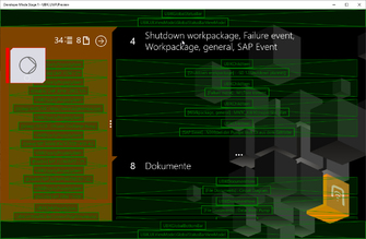
Stage 1
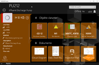
If there are lists currently displayed, the templates of the list items will be highlighted.
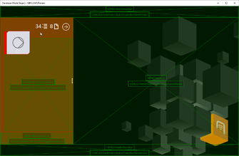
Stage 2
The area templates will be highlighted; if there are lists currently displayed, its item templates will not be visible.
Stage 3
The template of the whole page will be highlighted (Only available on some pages, e.g. ChildPage)
| Stage 1 | Stage 2 | Stage 3 | Stage 0 (non-developer mode) |
|---|---|---|---|
 |
 |
 |
|
Features
In developer mode, all templates on a certain page will be highlighted as a crossed-out green area with two buttons. The top/template button allows to edit the XAML file behind the respective area, and the bottom/context button allows to browse the properties, methods and commands of the underlying ViewModel/Context.
XAML Files
When pressing Edit XAML Template in the flyout with the name of the XAML file, the following will happen:
- If this template doesn't have a customized XAML file yet, UBIK® will copy its default XAML definition into the customizing folder, open the explorer and highlight it. From there you can use any text editor to modify it;
- If there is already a customized XAML file for this template, UBIK will ask whether you want to open the existing file or if you want to replace the existing file with the default XAML definition of this template again.
| If you switch on developer mode stage 2 on a page where a custom child area template is used, that custom name is displayed instead of the default "UBIKChildArea" text. |
When pressing Edit UBIKThemes in the same flyout, UBIK® presents the same options. Except it deals with the UBIKThemes.xaml file instead of the various template files.
| This button is accessible in any template button flyout and is a convenient way to get the most up-to-date default version of the UBIKThemes.xaml file. |
When pressing Unpack Default XAMLs in the same flyout, UBIK® places all default XAML files under the app's "LocalState\XAML\default" folder, overwriting any if already exists. This is provided as a last approach to fetch any default XAML template. We recommend using Edit XAML Template first if you can since that is more context relevant and places the template in the right folder for you to start your customizing.
Browsing the ViewModel/Context
When pressing the button with the name of the ViewModel/Context, UBIK® will open a browser that allows you to explore all its public properties, methods and commands.
| At the root level, a complete and up-to-date list of converters is also displayed. Their names/keys, which you should use in XAML customizings, are displayed in the first rows. |
Tapping on a member will pin that member and browse a level deeper. Tapping on the button on the left side of the member name, will trigger the following:
- If the member is a property P, an indexer I or method M , its path will be copied to the expression field on top of the browser and its result will be instantly evaluated;
- If the member is a command C the browser will navigate to its respective Execute method. Tapping the button of the Execute method will invoke the command.
Here is a list of all possible member types.
You can hover over a member in the list to get more information such as its description, usage, hints, etc.
|
Search field
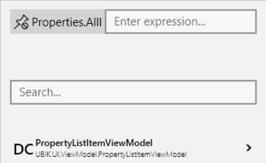
The second text field (the one that says "Search...") in the browser can be used as a filter to reduce the number of members displayed in the list.
- The search occurs as you type and the search text is case insensitive;
- Only members whose names contain the entered search text are shown in the list;
- The already pinned members are not filtered.
Expression field
The text field on top (the one that says "Enter expression...") allows direct input of an expression to be evaluated.
- The evaluation occurs as you type and the expression text is case sensitive;
- The context used for evaluating the expression does not change as you browse further into the list;
- The result of the evaluation (if there is any and it's not null) is displayed below the expression field.
Pinning a new context
Sometimes it is better to jump start with a specific binding data context instead of one that can be found in the standard UI. For example, while the default data context of a child page is a ContentPageViewModel, the inspection of its Properties.AllItems["NAME"] might be needed more frequently.
In such cases, you can evaluate the expression first. If the evaluation is successful, a pin button should appear on the right side. Once pinned, the type of the evaluated result becomes the new binding data context of the type browser and you can start browsing into that type directly. The expression of the pinned context is displayed on the left side of the expression field, alongside a button to unpin it.
Usage example
An example is shown in the picture. The template involved is UBIKChildArea and the context is a ContentPageViewModel.
- The search text "number" filters the list of members under ContentPageViewModel.ClassificationHandler.ChildInformation and only "NumberOfDocuments" and "NumberOfNonDocuments" are shown;
- The expression text "ClassificationHandler.ChildInformation.NumberOfNonDocuments" evaluates to 2 because the context object of this ContentPageViewModel carries child information and has two non document child objects;
- The result "2" is a primitive type and the string representations of these values are shown. For other types, you might see their type names instead unless they have their own ToString() implementations;
- You can browse to the level shown in the example and then click on the P next to "NumberOfNonDocuments". Or you can simply type in the above mentioned expression text at any level. Both would yield the same result;
- If an expression is successfully evaluated here, you can use the same text for bindings in the relevant template (UBIKChildArea in this case) and expect the same result.
Errors
Since custom templates are always loaded on demand, there is no way for UBIK upfront to check whether it contains errors or not. This section lists the possible errors and the respective behavior of UBIK.
Missing template
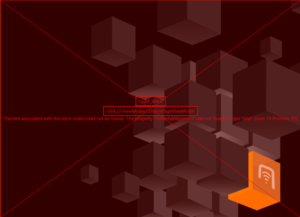
If an object requests a special template, e.g. through the child area template classification, UBIK will try to locate the respective file in the XAML customizing folder of the current profile. If the file doesn't exist, it will display a red error box in the respective area when the "Strict Template Loading Policy" setting is turned on . See more details.
| Clicking the Edit XAML button will in this case create an empty template with the requested template name in the XAML customizing folder! |
Parsing errors
If there is a syntax error in the XAML template, UBIK will try to surface the error message into the error template. This will most likely include a reference to the position in the XAML text that caused the error.
Runtime errors
These are the only errors that will lead inevitably to a crash of the App. An example for this would that your template tries to reference a StaticResource that doesn't exist. However, UBIK will still try to write the full exception message to [AppInstallPath]\LocalState\UBIKDebug.log before termination, thus the corrupted line can again be easily identified.
Other features
Reloading the UI
By hitting F5, all templates on the currently displayed page will be disposed of and reloaded. So if a customized XAML template file was changed, this change will be immediately reflected in the UI.
The time taken to reload the UI is proportional to the number of navigational steps taken to reach the current page (visible in UWP in the top bar). When working extensively on a specific page, it is recommended to navigate directly to that page using the search feature, in order to speed up the time taken for each successive reloading of the UI.
Furthermore, exiting Developer Mode also refreshes the UI, without disposing of it, making it an even more efficient way to immediately reflect XAML changes.
